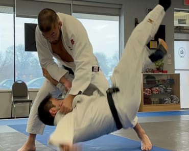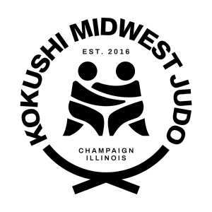
I haven't posted in a really long time because we've been a crazy busy with our expansion, re-opening and some cool clinics. We also decided to rebrand -- our logo was a bit outdated and I decided it was time to step into the current times. Our old logo didn't really tell people what judo was. I can tell you everything about the old logo -- it was an honorific to my first dojo and teacher, Sensei N. Ogasawara at Kokushi Dojo in Westwood, NJ. I didn't know what to call my new dojo, so rather than figuring out a complex Japanese name that I might later make the mistake of finding out that it means Potato.... I asked him if I name my new dojo, Kokushi.... and add Midwest, since we're in the Midwest. He was pleased. So the Japanese lettering in it, says Kokushi (down the center) and Midwest perpendicular to it. The red circle was a nod to Japan's rising sun. The blue waves represented one of my favorite pieces of art called, THE GREAT WAVE, and then it had little cherry blossoms throughout the waves because who doesn't love Sakura?!?! But when it came time to print ANYTHING, it was so complicated -- it was a blue gradient, with red, black, and white. And no one knew what the Japanese characters were. It was a beautiful logo, but no one knew what it said. So after our grand-re-opening, I decided it was time to do something drastic. I found a logo creator on TikTok. And he made designs that were so simple and creative. They were strong. So I asked him if he could do a redesign.... and after a week, he sent me a couple of ideas, and then we combined a few of them.... and we finally settled on what we have now. A fight for the grips in a single color. Some of the kids think it looks like a frog or a storm trooper.... I just love the simplicity of the message it conveys. Strong, simple, and effective.